Bar Charts in Excel
Previously we have learned about creating “Column Charts in Excel”. Now, in this blog post we will learn about how to create “Bar Charts in Excel”.

Now we have to convert this data into Bar Chart for better pictorial representation. We can do so by following below steps:


Similarly we can select any of the Chart Style of our choice to give special effect to our chart.

As we click on “Change Colors” option on Design Tab various color options will pop up on screen and we can select any option for example “Color 3”.


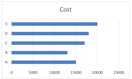
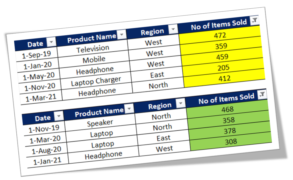
To explain in a very simple way, we have prepared a dummy data of 05 products: Product A, Product B, Product C, Product D and Product E along with their costs.

1. Select the data which we want to convert into Bar Chart.

2. Go to Insert Tab, Select Insert Bar Chart command under “Charts” group.

3. We will get further options for selecting Bar Chart. Out of these appeared option we have to select “Clustered Bar” under “2-D Bar” option as shown in below image.

4. We can see that Bar Chart is now ready for our selected data.

Changing Chart Style:
To change the formatting of our chart, click on the existing chart which will appear two additional tabs on our Ribbon. These tabs are:
1. Design Tab
2. Format Tab

Once we click on the “Design” tab, we can see various Chart Styles.

We can select any of the chart style, for example “Style 7” which will change our Chart Style as shown in below image.

Changing Color of Data Bars:
We can also change the colors of data bars. For this we have to select the existing chart and then need to click on “Design” tab and then click on “Change Colors” option.


The new chart with selected color will appear on our screen as per below image:

Similarly we can try various Chart Styles and Color options to make our chart beautiful.


Comments
Post a Comment