In this blog post, we will learn to crate Organization Chart in excel. We have posted one topic related to inserting SmartArt Graphic in excel. We will use these SmartArt Graphic to create Organization Chart.
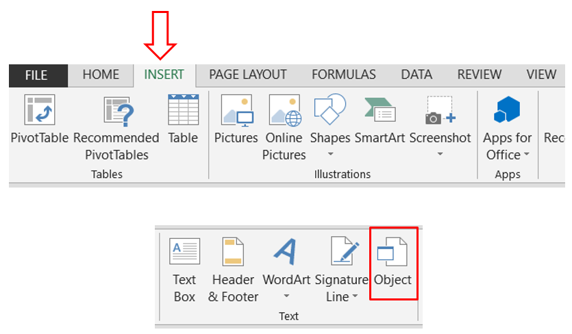
This SmartArt Graphic command is available in “Insert” tab under “Illustrations” group as highlighted in below image. With the help of this SmartArt Graphic, we will learn to create Organization Chart in Excel.
Once we click on “SmartArt” command, one dialog box named as “Choose SmartArt Graphic” will appear on our excel screen. We can find different categories on the left hand side of this dialog box. Out of these multiple categories, we have to select “Hierarchy”. With this we can see multiple designs under “Hierarchy” category. We can select any of those based on our choice. In this example, we have selected the red highlighted category.
Once we click on “OK” button after selecting this category, below SmartArt Graphic will appear on our excel screen.
We can also delete the unwanted shapes just by selecting the specific shape and pressing “delete” button on our keyboard.
The SmartArt Graphic will now converted into below design after deleting one shape.
We can also add shapes after, before, above or below the selected shape. For this we have to select the desired shape, press right mouse click and then select “Add Shape” option. With this we can see further options to add shape after, before, above or below the selected shape.
In this example, we have added 03 shapes below the shapes which are present in second row. With this, our SmartArt Graphic will converted into below design.
Now, we can add the names or the designation of our organization in respective boxes. We have listed below designations/names as an example for your reference.
We can also change the color of this Organization Chart. For this click on Design Tab, and then choose the color of your choice. In this example, we have selected the color which is highlighted with red in below image.
We can see the that our Organization Chart in now converted into selected color.
We can also change the SmartArt Style by clicking “Design” tab. We can find these styles under “SmartArt Styles” group. You can select any as per your own choice. In this example we have selected the style which is highlighted with red in below image.
So this is our final Organization Chart with changed colors and styles.
You can also try to create Organization Chart for your organization. For any doubts or queries, you can write us in comments section below.


Comments
Post a Comment