Line Chart in Excel


Now we will see how we can convert this data into “Line Chart” for better data visualization.
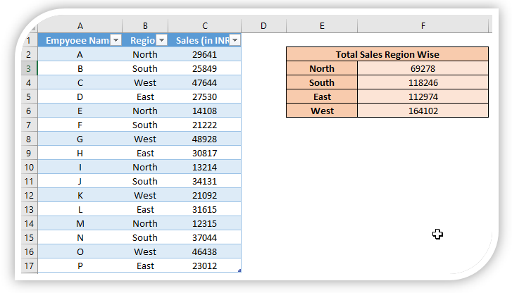
Just follow below steps:
1. Select the above data which we want to convert into "Line Chart".

2. Go to “Insert” Tab, Select Insert Line Chart command under “Charts” group.

3. We will get further options for selecting Insert Line Chart. Out of these appeared option we have to select “Line” option as shown in below image.


Changing Chart Style:
To change the formatting of our Line Chart, click on the existing “Line Chart” and this will appear two additional tabs on our Ribbon. These tabs are:
1. Design Tab
2. Format Tab

Once we click on the “Design” tab, we can see various Chart Styles for “Line Chart”.


Changing Color of Line Chart:
If we want to change the color of above created “Line Chart” then we have to select the existing “Line Chart” and then click on “Design” tab and then click on “Change Colors” option.


Now, our “Line Chart” with “Color 3” and “Style 3” will look like as shown in below image:


Comments
Post a Comment