“Table Format” in Excel
By using “Table Format” functionality in Excel we can convert our data into beautiful and attractive formats. Converting data into “Table Format” will gives us many advantages over normal data range. We will start this post by seeing how to convert data into “Table Format”.
Let’s take an example of sales done by 05 employees in Q1, Q2, Q3 and Q4 as shown in below image. We will use this data to convert it into “Table Format”. Just follow below steps:
1. Select any cell from the available data. In our case we have selected cell from top left corner of the data.

2. Go to “Home” Tab.

3. Select “Format as Table” command in Styles group.

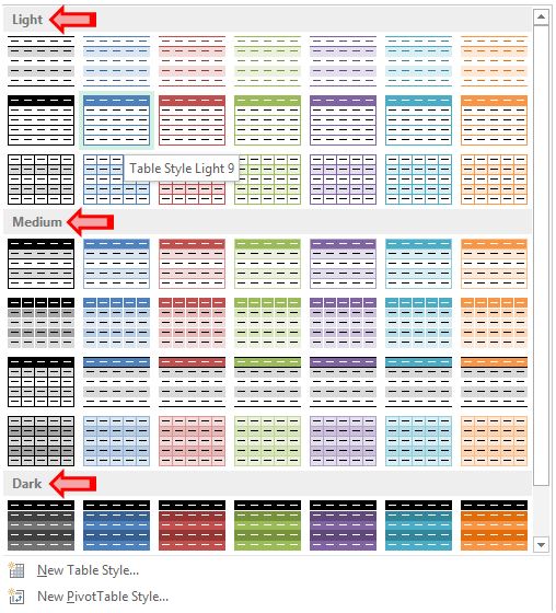
4. Once you click on “Format as Table” command, various table styles will appear on screen. These table styles are divided in 03 categories Light, Medium and Dark. Select any of these Table Style.

5. “Format As Table” window will appear on our screen as shown in below image. Click OK.

6. Once we click OK then we can see that our data will be converted into beautiful table style.

Isn’t this table looks cool and impressive to present our data in presentations? This is really cool and beautiful if you compare this table with your original data. You can able to find which one is looking attractive yourself!!!
Before this select any cell from the data which we have recently converted into “Table Format”. You will notice that one additional tab is now added in the Ribbon. This additional Tab is “Design Tab”.

When we click on “Design Tab”, many commands and groups will appear as similar to other tabs. In this post we are specifically going to see “Table Style Options” group from this “Design Tab”.

As shown in above image you can see “Table Style Options” group contains 07 command. Each of these are having checkbox. Some these check boxes in front of these commands are already checked and some are unchecked. But don’t worry, each of this field is explained in detail below.


3. Once you click on “Convert to Range” command, your table is now converted into normal data range. You will not see any difference in the first look as “Convert to Range” command will only convert table format into normal range. The previously selected formatting style will remain as it is. But one thing you can notice, “Design Tab” is now disappeared from Ribbon.

I am sure that after reading this post you will definitely start working with Tables instead of working with normal data range.

1. Select any cell from the available data. In our case we have selected cell from top left corner of the data.
2. Go to “Home” Tab.
3. Select “Format as Table” command in Styles group.
4. Once you click on “Format as Table” command, various table styles will appear on screen. These table styles are divided in 03 categories Light, Medium and Dark. Select any of these Table Style.
5. “Format As Table” window will appear on our screen as shown in below image. Click OK.
6. Once we click OK then we can see that our data will be converted into beautiful table style.
Isn’t this table looks cool and impressive to present our data in presentations? This is really cool and beautiful if you compare this table with your original data. You can able to find which one is looking attractive yourself!!!
"Table Style Options" of Table Formats in Excel
Converting data from excel file into a “Table Format” will give you lots of benefits. Let us see the benefits we are getting when we convert our data into “Table Format”.
Before this select any cell from the data which we have recently converted into “Table Format”. You will notice that one additional tab is now added in the Ribbon. This additional Tab is “Design Tab”.
When we click on “Design Tab”, many commands and groups will appear as similar to other tabs. In this post we are specifically going to see “Table Style Options” group from this “Design Tab”.
As shown in above image you can see “Table Style Options” group contains 07 command. Each of these are having checkbox. Some these check boxes in front of these commands are already checked and some are unchecked. But don’t worry, each of this field is explained in detail below.
1. Header Row:
Checking checkbox for this command will show the headers from your data. If you uncheck the checkbox for this command then the table headers from your table will disappear. You can see the exact difference when you check and uncheck this checkbox in below image.
2. Total Row:
Checking checkbox for this row will add an additional row at the bottom of the table which will automatically provide total of the specific column. If you uncheck the checkbox for this command then the Total row will disappear. You can see the exact difference when you check and uncheck this checkbox in below image.
3. Banded Rows:
This command will mark the horizontal stripes in the table. In other words we can say that when we check the checkbox for this command all the rows from the table are highlighted with bottom border. If we uncheck the checkbox for this command then the horizontal stripes from the table will disappear. You can see the exact difference when you check and uncheck this checkbox in below image.
4. Banded Columns:
This command will mark the vertical stripes in the table. In other words we can say that when we check the checkbox for this command all the columns from the table are highlighted with “Right Border”. If we uncheck the checkbox for this command then the vertical stripes from the table will disappear. You can see the exact difference when you check and uncheck this checkbox in below image.
5. First Column:
You can identify the first column from the table with this command. If you check the checkbox for this command then entire data from first column will get highlighted with “Bold” text. If we uncheck the checkbox for this command then the entire data from first column will appear as normal (not in “Bold” text). You can see the exact difference when you check and uncheck this checkbox in below image.
6. Last Column:
You can identify the Last column from the table with this command. If you check the checkbox for this command then entire data from last column will get highlighted with “Bold” text. If we uncheck the checkbox for this command then the entire data from last column will appear as normal (not in “Bold” text). You can see the exact difference when you check and uncheck this checkbox in below image.
7. Filter Button:
This command with add or remove filter buttons in your table. If you check the checkbox for this command then the filter buttons will get added in the “Header Row”. If we uncheck the checkbox for this command then filter buttons will get removed from “Header Row”. You can see the exact difference when you check and uncheck this checkbox in below image.
One important thing to keep in mind here is that to use this command we must check the checkbox for “Header Row”. If we uncheck the checkbox for “Header Row” command then ”Filter Button” command will remain disabled.
Converting Table back to Normal Range:
Working with Tables will give you a great experience. But anyhow you changed your mind and you decided that you want to go back to normal range from the formatted table. But how?? This is so simple!! Just follow the steps given below:
1. Select any cell from the table. Here we have selected cell from the top left corner of the table.

2. Now, go to “Design Tab” then “Tools Group” and select “Convert to Range” command.
1. Select any cell from the table. Here we have selected cell from the top left corner of the table.
2. Now, go to “Design Tab” then “Tools Group” and select “Convert to Range” command.
3. Once you click on “Convert to Range” command, your table is now converted into normal data range. You will not see any difference in the first look as “Convert to Range” command will only convert table format into normal range. The previously selected formatting style will remain as it is. But one thing you can notice, “Design Tab” is now disappeared from Ribbon.
I am sure that after reading this post you will definitely start working with Tables instead of working with normal data range.


Comments
Post a Comment